In this post
All about scatter graphs
Scatter graphs are used to plot two different outcomes against each other. This allows us to find trends in how data sets are linked. With this information we could look at two variables and see if there are any correlations between these.
Correlation – the link between two different variables and how these relate to each other.
In order to draw out a scatter graph you must plot both the x and y coordinates (much like in a graph) and then set each as a particular value. Let’s look at an example of how we might go about this below.
Example
The marks of 10 students in a Maths and Science exam were recorded in the table below with marks being out of 50:

Plot these on a scatter graph and comment on any links between the marks that students get in Maths compared to their mark in Science.
Here we need to use Science and Maths marks as our x and y on a graph. Then we can plot each individual student as required. Doing this will require us to use a clear graph and accuracy in our drawing.

From the above graph we can see that the scores of students in the Maths test have been plotted along the x, while Science scores are along the y. This allows us to see a series of dots that represent individual students. From this we can quickly see the scores of people by checking where each dot lies on the x and y axes. Looking at this we can see that the dots all tend to show a trend in the data – the higher someone scores in Maths, the higher they tend to score in Science. This is called a positive correlation as an increase in the x value on the graph gives an increase in the y.
Correlations in scatter graphs
Correlations on a graph can be one of three types. We either have a positive, negative or zero correlation (this is also called ‘no correlation’). A positive correlation is like what we have seen in our previous example – an increase in one amount will result in an increase in the other. A negative correlation is the opposite – when one value increases, the other will decrease. With no correlation we will not see a link between the data so will be unable to say how an increase or decrease in one variable will affect the other.

With a positive correlation, an increase in the x value will result in the increase in the y. This can be seen in the image shown here and can be very obvious when drawn on a scatter graph. In this situation we would assume that any increase in one value would result in an increase in the other. The same will be true for any decreases – if we reduce the value of x we will see the same reduction in y.

In the image here we can see a negative correlation. This is where an increase in x results in a decrease in y. Again, this relationship could be very obvious if the points make a clear line with a negative gradient. This type of correlation may be seen in many situations, for example an increase in the number of a predator in the wild would likely result in a decrease in the numbers of prey.

The other option that can occur is when two variables have no correlation at all. This is known as zero correlation. This will happen if the two things we are measuring are not linked in any way and therefore no correlation is found. An example of this may be the colour of a person’s car when compared to their IQ – it is very unlikely for there to be a link between these two factors so a zero correlation would be expected.
Correlation strengths
The strength of a correlation can be measured once we have plotted our values. If we see a positive or a negative gradient in the dots then it is easy to comment on the strength of the correlation. The strength is simply how closely the points look like they are in line with each other. It might be that you get a positive correlation where the points are in a perfect line – this is known as perfect positive correlation. However, it is most likely that the points will be aligned but not perfectly. Below is an example of perfect negative correlation when compared to just a normal negative correlation.

Lines of best fit
A line of best fit is a line that we can place on a scatter graph that is as close as possible to the points shown. This line will be drawn in by us so will not be perfect – it is only used as a representation of the gradient seen when linking two variables. For this reason it is a good thing to use but it is not exact.
Key term
Line of best fit – a line that is placed on a scatter graph and is as close to the points as possible.
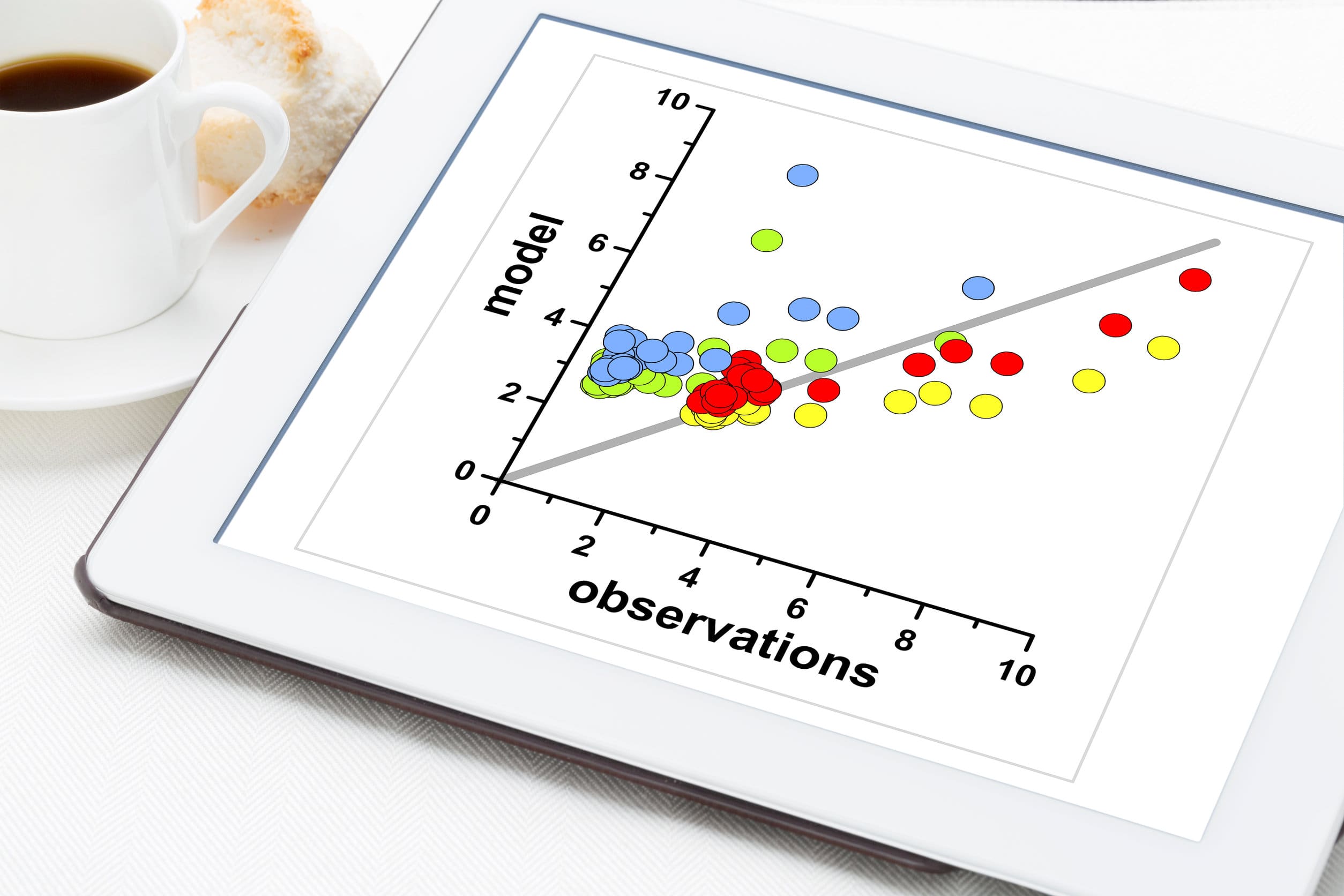
Any scatter graph that has either a positive or a negative gradient can have a line of best fit drawn. However, we are unable to do this when a zero gradient is present. Below is an example of a positive gradient with a line of best fit.

Here we can see that the points on the scatter graph have had a line placed amongst them that is the line of best fit. This line has been closely placed so that it has a similar number of points on either side and therefore is the best representation of the correlation in the data. Although a line of best fit does not need to be perfect, we should try our best to have an equal number of points on either side so that we know the line is a good representation of the data.

