In this post
Interquartile range
The names of these two ranges do sound rather complicated but really they are quite straightforward and are defined as:


By using these two equations we can find values for the interquartile range and semi-interquartile range easily by just using the values for upper and lower quartile that we already know how to work out.
Example
You are told that the lower quartile for a data set is 38 and the upper quartile is 52. Find the interquartile range and semi-interquartile range.
For the interquartile range we must take the lower quartile from the upper to give:

So the interquartile range is 14. And the semi-interquartile range is half of this which is 7.
Two data sets may have the same mean, median and mode but different ranges. The best use of an interquartile range is to disregard any very high and very low values which may have occurred due to inaccuracy in testing. The interquartile range then gives us the middle 50% so we have data that is much more accurate as it is better to compare the interquartile ranges of two data sets.
The ranges will then tell us of the spread of the data. If the range is large then the values vary a lot more than a data set with a smaller range. This then gives us an idea of the data accuracy. If the ranges are small, the data is more accurate. If the ranges are large, the data is less accurate.
Box plots
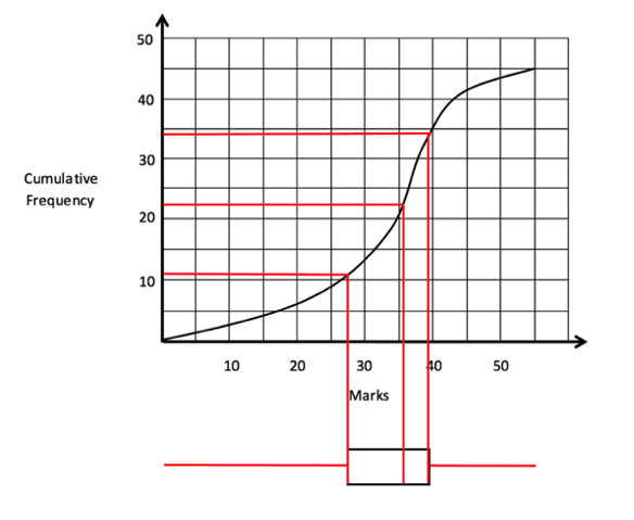
A box plot (sometimes known as a box and whisker plot) is a very useful tool when working with cumulative frequency graphs. The box plot is often drawn beneath the graph and will display the range of the data, the upper and lower quartiles (as well as the interquartile range) and the median. This information will allow us to draw conclusions from the data and is all very easy to spot from the box plot. The example below uses the same curve seen earlier in this section with a box plot added.

This box plot has essentially been drawn by extending the lines we create for the lower quartile, median and upper quartile. The ‘whiskers’ on the plot are the red lines that extend horizontally and show the full range of the data from the lowest value to the highest. This means that, from one box plot, we have been told all the main data that is shown in a cumulative frequency graph.
Using box plots we can compare data without even having to plot the cumulative frequency graph. We could simply align two different box plots and then compare the vital data from each to see any differences in the information.
Example
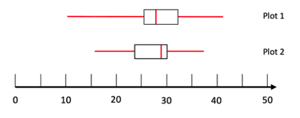
Look at the two box plots below and comment on the differences in the data.

In this example we can immediately see that the two box plots have different lengths of whiskers – so plot 1 must have a larger range (approximately 32 compared to a range of 21 for plot 2). We can then see that the interquartile ranges are very similar (this is shown by the middle boxes width) and both are around 7. Plot 2 has a slightly higher median of 29 compared to 28 in plot 1. Finally, the upper and lower quartiles of plot 2 are both lower than in plot 1.
All this information will allow us to draw conclusions when comparing the two sets of data. We know that they have similar interquartile ranges and medians but plot 1 has a higher average and wider range of data.


