In this post
Businesses will need to understand the break-even point of their company in order to keep a check on finances. The break-even levels of output in a business are when the total costs are equal to the total revenue. At this point a business will have covered all of its outgoings with the money earned and will have made no money, but lost none either.
Calculating the break-even point
In order to calculate the break-even point, certain information is required. This includes:
- Fixed costs to the business
- Variable costs per unit of stock created
- The selling price of each unit of stock
Using these three different figures we can create a formula which is used to work out the break-even point on a business.

Let’s take an example where a business produces magazines at a cost of 20p each and sells them from £1. This magazine company also has fixed costs for this of £25,000 per year. We can now use the formula above to calculate the break-even point for this business.

This means that the break-even point for this business is 31,250. So, the business must sell 31,250 magazines in order to break even and cover all of its costs. Notice here that the sum has a pound sign above and below the division sign so they cancel out, leaving an answer that is not in currency and is instead a number of products that must be sold.
Margin of safety
After a business has hit the break-even point and continues to sell products it will move into the margin of safety. This margin is the area where the business will have covered all of the costs it has incurred and will have begun making money. In the example we used above, the margin of safety for the magazine company is when it has sold over 31,250 units, as the money that is now made will be profit. The size of the margin of safety can vary but is defined as the amount of sales that have been made minus the amount of sales required to break even.

Interpreting break-even diagrams
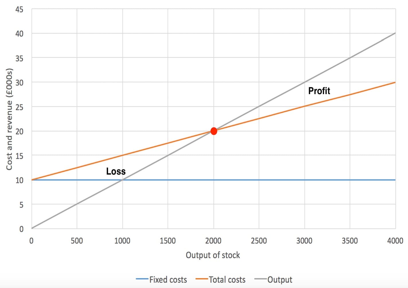
Break-even diagrams are a great asset for a business that wishes to track the amount of money it makes and its profitability. Break-even diagrams are used to find areas where a business will lose money, break even and turn a profit. Break-even charts are created by drawing a graph showing fixed costs, variable costs and the output of products for a company. You can see this in the diagram shown below.

The above break-even chart shows the relationship between the costs to a business, the output (x axis) and the revenue for the business (y axis). We can see the fixed costs being £10,000 per year (the blue line) and the variable costs increasing (the red line). The grey line then shows the output (the number of items sold) compared with the revenue to the business. Plotting all three of these lines at once allows us to see the relationship between the costs to a business (the red line) and the revenue (the grey line).
The red dot in the middle is the break-even point where the business will cover all of its costs. This means that the business will need to sell 2,000 items of stock (read through the x axis) in order to cover all of the costs incurred for the company and break even. When the business sells more than 2,000 items it will move into the section labelled as ‘profit’. This is the margin of safety in the business and anything over the break-even point represents a profit. On the other hand, if a business sells less than what is at the break-even point then the costs will outweigh the revenue. This is shown in our example as being any number of products sold that is less than 2,000 and will lead to a loss for the company since the costs are more than the revenue.
When plotting a break-even diagram it is fairly easy to draw the fixed and total costs lines. These can be added fairly simply as the fixed cost line will be horizontal all the way across to ensure it represents the same price at all times. The total cost line can then be added by calculating the manufacturing costs of products. This line then shows the relation between the number of products made (the x axis) and the total cost for these to be made.
The final line is possibly the trickiest to calculate. This line is the output line and represents the amount of revenue made compared to sales. To work this out we need to know how much a single unit is sold for by the company. If a product is sold for £5 then the line will show that for every additional product sold, the revenue increases by £5. In our example from earlier we can see that when 1,000 products are sold (the output on the x axis) the revenue (on the y axis) is £10,000. This means that each product is sold for £10.
The impact of different revenues and costs
If the costs of production change for a business, then the red line shown in the diagram we had earlier will move upwards. This means that the break-even point will move upwards as well (remember this is the point where the output and total cost lines meet). This results in the break-even point being higher so the business must sell more products in order to reach the margin of safety and make a profit. This is obviously something that the business will try to avoid since it must sell more products just to make money. On the other hand, if the costs to the business are reduced then the total cost line will move down the graph. When this happens the break-even point will move down also – meaning that fewer sales will need to be made in order to break even.
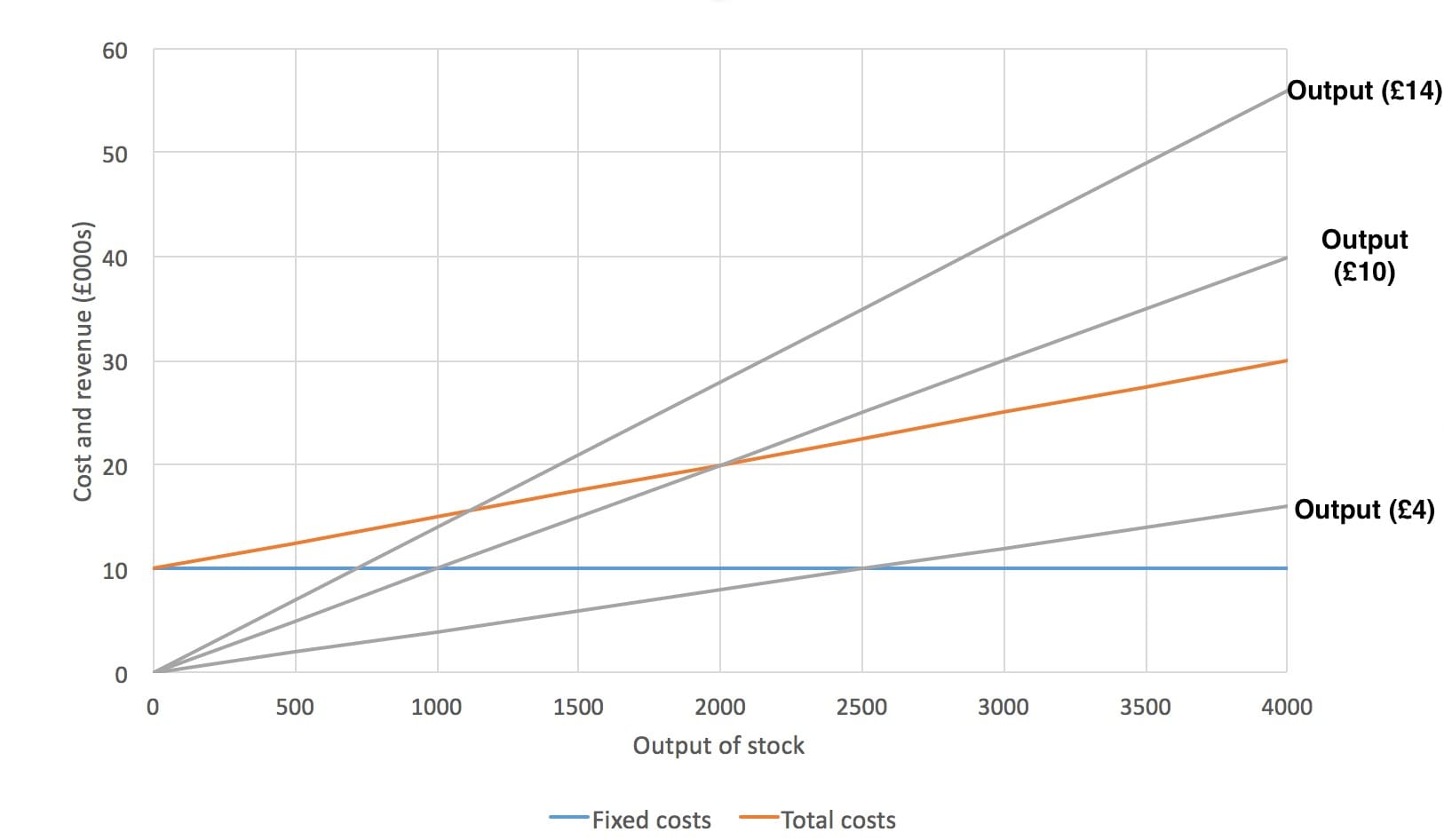
A change in revenue can come about from a business putting the price of a product up or down. This may be done depending on the demand for a product with customers or if specific promotions are currently being used. This change in cost for a product will change the gradient (steepness) of the output line. An example of this is shown below.

In the diagram above we can see three different output lines. One that represents a sale price of £4, one that represents a sale price of £10 and another that represents a sale price of £14. The gradients of each of these is different, giving a very different break-even point. Here we can see that the break-even point is 2,000 units of stock when selling for £10 and around 1,150 when selling for £14 each. Something interesting happens when we try to calculate the break-even point when selling for £4 though. If we look at this line, we see that it never crosses the red total cost line. This means that at no point on this graph does the revenue become more than the costs. Obviously, it would be a disastrous idea for a company to sell this product for £4 as they wouldn’t even make enough money to break even.


